Part I and part II of the graphic style analysis series explained the major aspects of graphic styles. This third installment should give you a better understanding of the forces behind styles. Visuals are not developed in vacuum. They take shape according to given circumstances. When we understand the affective forces we may find new forms of game visuals more easily.
Hardware-Driven Graphic Styles
Games tried to simulate reality from the very beginning. First games were abstractions of fights in space or Tennis. Better (speak more realistic) graphics need better hardware. This simple rule pushed computer graphics to its current state and will push it beyond.
Modern gaming hardware already has very advanced 3D rendering capabilities. But there is always something better on the horizon. Photo-realism is the major league of graphic styles and just for the big players in the game dev business. It is expensive in cash, time and artistic skill so that small indie game developers can’t compete here. The only exception I know is id Software. It was THE visuals-driving independent game dev studio in the last two decades. I don’t know if it is still in such high regard in these days.
Most independent game developers don’t have the resources for riding the bleeding edge technology wave. Therefore they need to bet on simpler (less hardware demanding) or alternative graphic styles. Simpler styles broaden the target market because Joe Public does not think about graphic cards or drivers. He wants to play, period. Blizzard used the same approach for World of Warcraft. Its graphics are mediocre but do well for most players.
Conclusion: Don’t use photo-realism unless you have an eight-digit bank account. Everything else is fine.
Effort-Driven Graphic Styles
Everything visible in the game makes some effort. That can be sprites, meshes, textures, normal-maps, particle effects, text, animations, physics, lip-synch, etc. Unless you don’t have a rich dad you will have to strip off some of the fancy stuff you have in your mind about your game. Let’s have a look on some examples:
- Today’s monitors have a rather high resolution. More pixels per sprite means more pixels to draw. Abstraction may help here. Or publish your game on devices with smaller resolutions.
- Animations are expensive. Avoid it where possible. Use objects which don’t need to be (manually) animated.
- Less is more. Reduce color palettes, details or number of animations. Use vertex painting instead of textures.
- Use just basic shapes like squares, triangles, circles, cubes or spheres for your objects. Exploit angularity, avoid organic stuff.
- Keep away from (known) reality. That’s the reason why many early games took place in future/space.
- Reuse as much as possible. Take the green dragon model and paint it red. CPU can do this for you to.
Saving development cost may also create a unique graphic style for you. Don’t limit yourself just to existing styles. Take a look at older games, mainly from pre-CD eras, and find out how restrictions formed their styles.
Art-Driven Graphic Styles
Games like the already mentioned Okami or LOVE simulate painting techniques from the real world. It’s a good way for differentiating your game from others. But simulating real-world painting in games isn’t easy. Otherwise we would have seen more games with a painting touch.
Let’s have a look on some more computer oriented art: Demos. Demo creation is a long running discipline of producing multimedia with limited resources. Take a look on these videos from farbrausch to get an idea what demos are:
Get inspired by these videos and every piece of art which could make a unique graphic style for your game. Don’t restrict your thinking to realistic colors and shapes. Tempest 2000, Tron 2.0 and Rez didn’t it either.
Fin
That’s the end of the whole graphic style analysis series. I hope you could find something useful here.
My intention for this series was to show that styles are not only flashes of genius in artistic minds. They are bound to scientific restrictions as well which still evolve over time. Let’s keep an eye on these fading restrictions and test unoccupied territory. It’s like a journey through the young wild west of game art.
Cheers,
Thomas
In part I I’ve explained the most obvious aspects of graphic styles in video games. In the second part of this article series I’m going to add some narrower points to the list. They are visible at all but won’t be experienced as important as for example 2D/3D differences.
Resolutions
High resolutions like full HD or higher are common these days. They are possible because we can buy advanced hardware (HD flat screen for consoles or 1920×1200 monitors for PCs) for a song. This was not the case back in the 80’s and 90’s when game production was in its younger days. Early personal computers used television sets as their display devices. Therefore resolutions were bound to PAL or NTSC, many standards having dimensions about 320×240. As technology advanced standards rose to 640×480, 800×600, 1024×768, etc.
Most game genres are resistant to varying resolutions, e.g. first person shooters, casual games or racing simulations. This is because their game objects are large enough to be identifiable at weak resolutions. Genres like strategical simulations suffer from low resolutions because they use much text for displaying the game state. Text is a bottleneck because it needs a minimum of pixel height to be readable. This is the reason why text-heavy games had their home on PCs while action-driven games settled on consoles. The console joypad was important to but that’s another story.
Today games are commonly hi-res. Low-res is either used to support older hardware, smaller devices (iPhone, DSi, PDA) or for creating a retro style. There are even games which use their transition from low-res to hi-res as USP like Super Street Fighter II Turbo HD Remix does.
Color Palette
Alike resolution colors were a question of hardware restrictions in the old days. The minimum color palette has two colors, mostly black/white or black/green. You can’t get lower than this because a pixel just needs one bit of memory. Less graphical information is no information at all.
Over time graphics components in computers became more powerful and used more color bits per pixel (BPP). For example CGA had a maximum of 16 colors (4 bits), VGA’s Mode 13h had a maximum of 256 colors (8 bits), XGA raised the bar to 65K colors (16 bits) and SXGA finalized the BPP increase to 16.7 million colors (24 bits) for mainstream displays. The human eye is not able to distinguish small color differences in higher BPP rates. Only image post production, mainly in the movie industry, profits from higher rates, e.g. 48 BPP.
Color palettes may comprise of colors from the RGB color space or may just use different shades of a single color. The Game Boy color palette is a good example. It just uses white, light-grey, dark-grey and black. Another more awkward example is the black/red LED display of the Virtual Boy. Aggressiveness guaranteed:
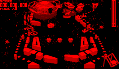
Virtual Boy’s Galactic Pinball courtesy of www.vgmuseum.com
Restricted color palettes are no longer barriers but tools for game artists. Games like Machinarium or Limbo use them for creating atmosphere and style. As with small resolutions small color palettes can be used for creating a retro style to.
Edges And Faces
Visual objects always have a body and a silhouette which delimits the body from the environment. A few games like Vib-Ribbon or initial Elite versions strip off the body and use just the edges. Most games don’t accent edges, only the body surface is important. Real life does not accent edges either. Games like XIII use both, body and edges, to create a unique graphic style. This is not restricted to 3D mesh objects. Ultima 8 uses 2D sprites which show the body combined with black edges.
This graphic style aspect does not seem to provide much artistic freedom. But there may be some future styles buried beneath. What about using different “brushes” for the edges? Crayon Physics Deluxe already did it. What about displacing the edges from the face borders? Finally shaders provide many more possibilities than we see today. LOVE proves it.
Camera Movement
In the pre-3D (navigation) era nobody talked about camera handling in games. Views were fixed to top-down, from aside or from behind. Everything in between was named isometric. Panning was known as scrolling and zooming was rare but possible. I think Sim City 2000 had fixed-step rotation around the vertical axis to but I’m not sure about this. All these more or less implicit constraints made choosing the correct viewpoint a breeze.
Expanding interaction to the third dimension introduced a whole bunch of new problems. Position, orientation, rotation, speed and view angle of the camera were no longer a simple derivation of scene states. Handcrafted camera paths, new play-test routines and new camera movement algorithms had to be added to the game production schedule. Today we have some algorithms for autonomous camera movement. Most of them can’t make manual camera adjustment obsolete. A task no player should be bothered with, it does not provide any fun.
Games like the first Resident Evil instances use special fixed camera positions for adding thrill. The “head mounted view” of first person shooters puts the player directly into the game world. Viewpoint is one of only few isometric shoot ’em ups standing out of the crowd, regardless of its brutal difficulty.
Conclusion: Special camera positioning can make a different gaming experience.
End of Part II And Outlook on Part III
This is the end of part II. The presented aspects may not make the biggest differences between styles but they help adding a unique note to them. Details make or break a game so they should not be underestimated.
Upcoming part III of this analysis series will show some pragmatic approaches to the graphic style question. Hardware, budget, time, ethics or game design may influence the graphic style. Games should not use graphics merely as transport layer of the game state from RAM to the player’s eyes. Game design and graphics should be developed side by side. The outer reflects the inner. The inner may abash the outer.
Cheers,
Thomas
Discussions on the Internet about differences of graphic styles made me pondering. How can graphic styles be distinguished from each other? The answer to this question is simple: Definition. First we have to define what graphic styles are and what they are made of to understand their differences. I’m going to describe the most important parts of graphic styles in video games here. Well, as far as I can judge it 😉
The Battle Between 2D and 3D
Separating graphic styles just into 2D and 3D does not work. Pure 2D styles were commonly used for old games like Pac Man, Tetris or Super Mario Bros. These examples completely lack a third dimension, visually as well as interactively. Full 3D is used in modern blockbuster games like Fallout 3, Assassins Creed 2 or Crysis 2 (BTW: did you notice the sequel virus?).
Harder to categorize are games like Head over Heals or Super Mario RPG which use navigation and interaction in three dimensions but don’t use real 3D graphics. They fake it. How do we call these games then? Isometric? Pseudo-3D? What about games which use a pure 2D navigation scheme but use flat rendered 3D assets like Donkey Kong Country? What about Mortal Kombat? It has character sprites taken from real world (3D) people while fighting takes place in a 2D plane.
In my opinion it is not a question about graphics but navigation and interaction. When the player can interact with all three dimensions it is a 3D game. Everything else is 2D. Somebody may notice that the fourth dimension is used in some games as well. Braid is the best example here, a 2D platformer with time handling. 2 + 1 = 3 dimensions. Ok, it starts to become complex here. Let’s restrict the definition to the three dimensions of space without touching time.
I’m wondering if anybody can come up with a 1D game?
Discrete vs. Continuous
The chapter title uses two fancy words from mathematics. They can simply be translated to rasterized (discrete) and vectorized (continuous). The common opinion about these two categories is:
2D is raster, 3D is vector
Most Flash games use vector graphics in 2D. This is well known and kills the statement immediately. Examples for the opposite, namely 3D rasters, are rare. They use the almost forgotten voxel technology. In the advent of rendering 3D models to screen some games were made using voxel engines. The computational advantages of vector mathematics as well as the chunky aesthetics of voxel models kicked the voxel approach out of the 3D race. Finally textures, shadowmaps, heightmaps and similar rasterized data form discrete assets in mesh-driven games. That makes modern game engines hybrid solutions. Do you know any pure 3D vector engines?
Realism vs. Abstraction
This aspect of graphic style has a large spectrum. Realism, or better photo-realism in video games, is just one part. Others are:
- cel-shading (Zelda – Wind Waker),
- painting techniques (Okami or LOVE), get inspired by this list
- psychedelic (Killer 7),
- “avoid the uncanny valley” style (Team Fortress 2)
- comic (Valkyria Chronicles),
- wire-frame (Vib-Ribbon),
- cut-out design (Paper Mario),
- digitized sprites (early Mortal Kombat games),
- any more?…
In my opinion this is the essence of the whole graphic style discussion. It can make a unique selling point to.
End of Part I
I’m going to stop here because I don’t want to pack all my thoughts about graphic styles into one blog post. I will continue this in the next post. So, stay tuned and drop me a comment if you like.
Cheers,
Thomas
I was really busy since the first post about learning pixel art. I investigated many screenshots of other shmups to learn from them (many thanks to the huge review archive at www.shmups.com).
First of all: Most of these shmups look just amazing! I wonder if I ever will come close to any of these artists.
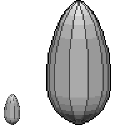
Second: No game used the hard edge style. So I tested how the red plane looks like without edges:
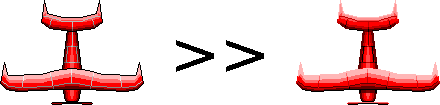
In my opinion the the old version looks better. But it may integrate better in the game without edges.
I played around with GIMP for a nice camouflage texture and different colors:

That was nice and did not take much time. Full of enthusiasm I set up a new blank canvas and drew the following… “thing”:
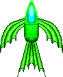
What the hell is that?
I really don’t know but it looked better while I was drawing it at closeup 🙂 It was a test for vehicles with organic shapes.
This last creation was so disappointing that I turned off all the graphics tools and started searching for more pixel art tutorials. It took several hours and these are the most important:
- Basics
- Coloring
- RPG stuff
- Old school logo
- Tutorial collection 1 (some dead links)
- Tutorial collection 2 (kick ass stuff!)
Following these tutorials step by step I started another try. Most games use very small sprites for their player vehicles. So I shrinked the canvas to 40×44 and created this one:
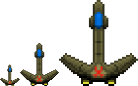
That’s not so bad, is it?
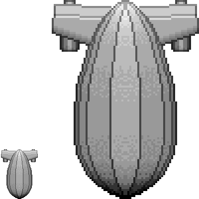
Finally I thought about vehicles that are a little more “steampunky”. To this point the sprites lacked the steam and brass flair. The usual Steampunk aviator has some kind of balloon ship. So I started a war Zeppelin. I’m going to show you how I made it, step by step.
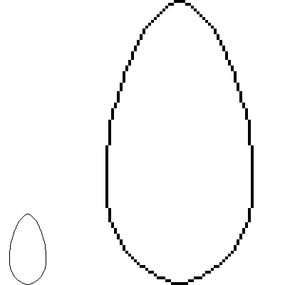
The outline of the balloon:
First I used a clean black line for the balloon outline.
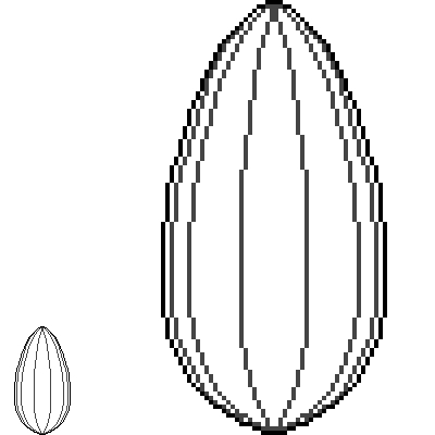
Inner edges:
Then I added the edges inside the balloon shape with a different color (dark grey). The lines are symmetrical. This symmetry will save a lot of work in further steps.
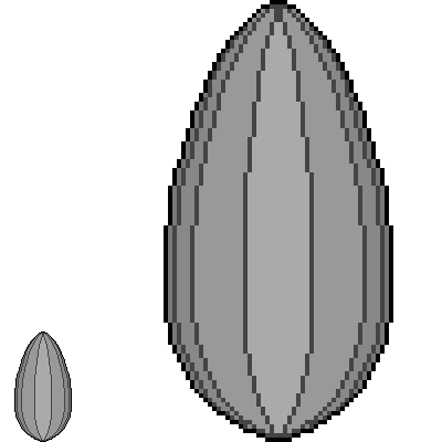
Basic color:
As a basic color I used an average grey tone (RGB = 128, 128, 128). This is useful for coloring the sprite later.

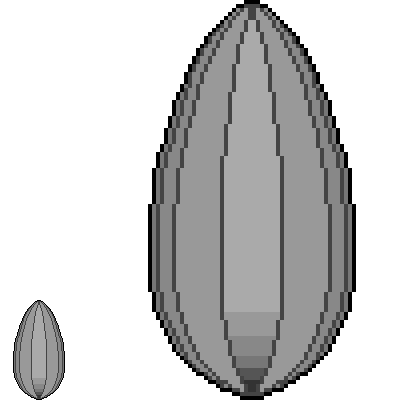
First shades:
I declared the light to be centered above the balloon. Therefore I darkened the side segments. The more a segment is aside the darker it gets. I shaded just one side and mirrored it to the other side. This is only possible when the light source lies on the symmetry axis of the sprite.
First shadow gradient:
Further the light source was declared north of the sprite. Therefore the south gets darker. The gradient supports the curved balloon shape. Here I just drew the gradient for the middle segment.
First highlight gradient:
The opposite was done for the northern end of the balloon.
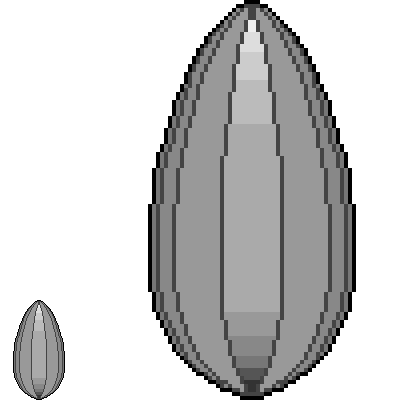
Shading the other segments:
Here I distributed the gradients of the middle segment to the other segments. The balloon gets darker on the side segments so the gradients have to get darker to. After drawing the gradients left I mirrored them to the right side.
Dithering:
Dithering is a trick for giving a surface a smoother look. I just placed the dithering pixels randomly.

Shading the edges:
The surface between the edges got shaded. After this I applied the surface gradients to the black edges. They are still darker than the surface for keeping the edge character. The mirror trick is applicable but destroys the asymmetry of the dithering.

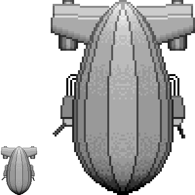
Turbines:
Here I gave the Zeppelin its turbines. They were made the same way as the balloon: outline – vertical gradient – horizontal gradients – dithering – edge shading.

Wings:
The Zeppelin needed wings to mount the turbines onto. So I drew a simple wing shape and mirrored it. I stretched the turbines for jutting out below the wings.
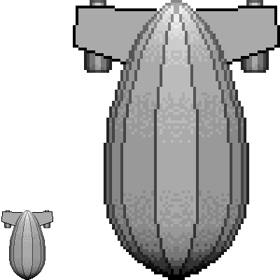
Wing profile:
Here I set the base for shading the wing profiles by beveling them: a darker color south, a brighter color north.
Smoothing the wing profiles:
The southern wing edges got a fluent gradient for a roundish appearance. The northern edges were left flat but received additional joint shades.

Shading the wing edges:
The same procedure as used for the balloon.
Make it a war machine:
What would a shmup sprite be without guns?
Steampunk coloring:
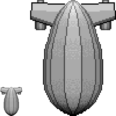
Tools like Photoshop or GIMP (and even Graphics Gale) make it easy to color greyscale graphics. Steampunk graphics often use grey and brown tones. So: here is the final result:
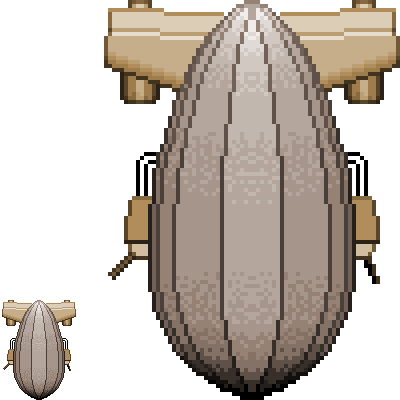
I hope you enjoyed this “built-in” tutorial. If you know any hints, tricks or good tutorials for pixel art: Please let me know.
Cheers,
Thomas