How to Shrink PNG Files for Websites
Today website development heavily relies on three image formats: JPG, GIF and PNG. It’s easy to see why: JPG has the best compression ratio, GIF supports animation and PNG has truecolor, full transparency and a good compression ratio.
As rules of thumb I’m using these hints:
- Opaque pictures? Use JPG.
- Want animation? Use GIF.
- Transparent areas in your image? PNG is the answer.
An additional decision factor is the file size. It’s still an important factor for websites, regardless of connection bandwidths. Slim sites are king. Ask “lightning-fast page delivery” Google.
When it comes to compression JPG prevails over PNG in most cases. JPG simply is a lossy format while PNG is lossless and has to keep all the information intact. Therefore most images on the Internet use the JPG format.
But JPG alone does not cut the mustard for graphically complex sites. Wherever a non-rectangular shape appears transparency comes into play. JPG does not support it so we have to bank on GIF or PNG. When pixels are either fully opaque or fully transparent you can get away with GIF. Despite GIF has compression it generally succumbs to PNG. So PNG is the best choice when it comes to transparent stuff on the Internet.
After using PNG on websites for a while you will see that its compression leaves much to be desired. The files are just too big. But how to shrink them?
The advantage JPG has over PNG is that it can drop details in favor to file size. So why don’t we use similar methods for PNGs?
Here are some tricks for reducing details in images to get smaller PNG files. I’m using Gimp for this but the procedures should be similar for Photoshop or other image manipulation tools.
Use Less Colors
The human eye can distinguish about 10 million colors. Theoretically this should be our threshold when we reduce color spaces. However, in practice it’s unimportant how many colors we can see. It’s just important to stay above the limit where graphics become ugly.
Check out the following image sequence. The first image has 8 bits per color channel, the next has 7, the next has 6, and so on:


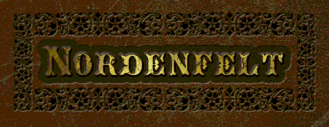
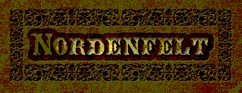
Which is the last image with acceptable quality for you?
Surprisingly 3 to 5 bits per color are enough for our visual sensors. That’s makes up about 0.025% of the 24 bit color space.
Less bits per pixel make smaller images. So how can we reduce color depth? It’s really easy, it’s just one function in Gimp: Colors->Posterize:
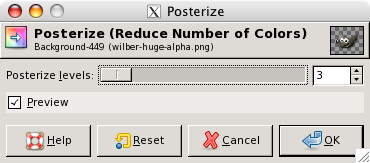
Just set the number of levels you want for your image. Levels are the possible steps per color channel. So 3 RGB channels with 2 levels would result in a color space cardinality of 8, 3 levels would give a total of 27 colors, 4 levels make up 64 colors, etc. Due to this exponentiality the quality improves logarithmically. Increasing a low level gives a massive improvement. Each additional level provides less improvement. On the other side (uncompressed) file size rises exponentially. So it’s the usual tradeoff between cost and quality.
I think you will be surprised how much can be done with a small amount of colors. Usually this method can half PNG file sizes without much quality loss.
Adjust Transparency Depth
Transparency can be scaled like color depth. This can be done by extracting the alpha channel, shrinking the transparency spectrum and stuffing it back into the image. For this use Gimp’s function Colors->Components->Decompose… with RGBA mode and select the alpha channel image. Now use Colors->Posterize to reduce the transparency depth:
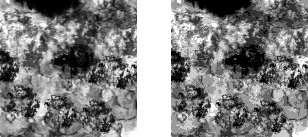
The left alpha image uses 256 shades of grey. The right image shows the same channel reduced to 6 colors. At the moment it looks like a big quality loss. But check out the final result after reintegrating the alpha channel into the original image using Colors->Components->Recompose :
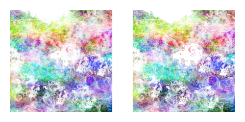
The differences are marginal. Often it depends on the texture an image has. If it’s rather fractal like the example used here reducing alpha depth is an option. On the other hand shrinking transparency of fluent gradients is conspicuous . Human eyes have a high dynamic contrast ratio. So don’t try too hard optimizing smooth transitions.
Playing around with transparency regarding file size does not pay off as much as reducing colors. Nevertheless it can rip off a nice chunk of fat.
To Interlace or Not to Interlace
PNG’s interlacing option allows web browsers to show low-resolution version of PNGs before their download is completed. The good thing about this is that graphics pop up earlier. The drawback is that it increases file size. You have to decide what’s more important for you: faster low-res or slower high-res.
Divide and Conquer
When you are creating an image where just a small part is transparent splitting it up into multiple files can reduce download times. Check out this image:
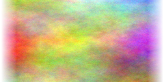
Just the gradients on the sides have transparent pixels. Most of the image is opaque and therefore predestined for the JPG format. It could be split it up this way:
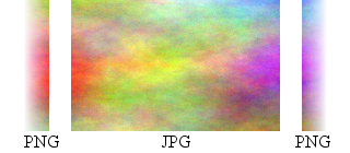
Such split graphics are commonly used for graphics-heavy websites. It’s just important to keep the sum of file sizes below the original file size.
Compression Tools
There are many image compression tools and services available on the Internet. Have a look:
Sometimes they can shrink image files quite good. But in most cases it’s just a small percentage they can rip off. It’s not exactly brilliant but a nice final improvement step for your graphics.
Know Unimportant Information
The last advice is a general one. You have to know which details you can drop without sacrificing (too much) quality. The methods shown here are just a few available. Further methods could be color-specific reductions according to human high dark-color-contrasting or the higher sensitivity to green. Aside optimizing images themselves you can try using as few images as possible. Many web 2.0 templates use just colors, tiny images and smart tricks to create the illusion of texture and depth.
The best optimization is the one you don’t have to do.
Cheers,
Thomas